Client:
International Food Policy Research Institute
Role:
Lead Designer
Skillsets Used:
Stakeholder interviews, wireframing, prototyping, CSS
Shaping Food Policy
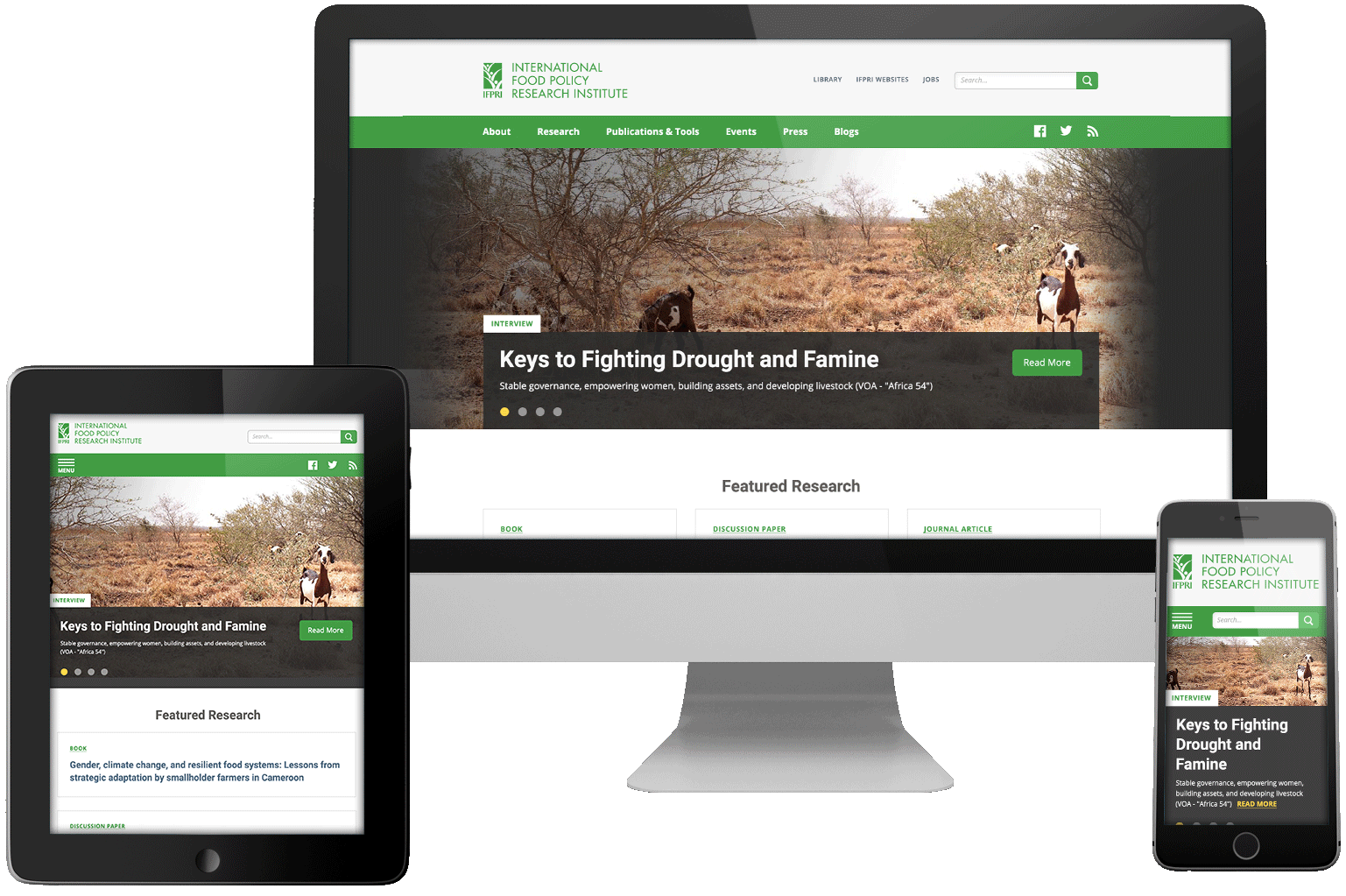
The International Food Policy Research Institute is a non-profit organization dedicated to providing research-backed policy solutions to reduce worldwide poverty and hunger. As the lead designer, I collaborated with a project manager and a team of developers to optimize the user experience and interface while working within strict technical constraints.
- Upon project commencement, there was little to no user feedback or metrics, so calculated iterations became crucial.
- The analytics that were available indicated substantially high bounce rates due to the lack of clear calls to action and confusing content structures.
- There was little time or budget to onboard users to an entirely new experience, so we needed to work within some tight technical constraints in providing a more optimized experience.
- A search-style experience dominated the website as a catch-all, including instances where the functionality didn't make a lot of sense.
- The site did not meet accessibility standards, so I made that the top priority in the redesign.
We began the iterative process by updating the site's glaring interface issues. This allowed us to uncover the more significant underlying problems with the user experience.
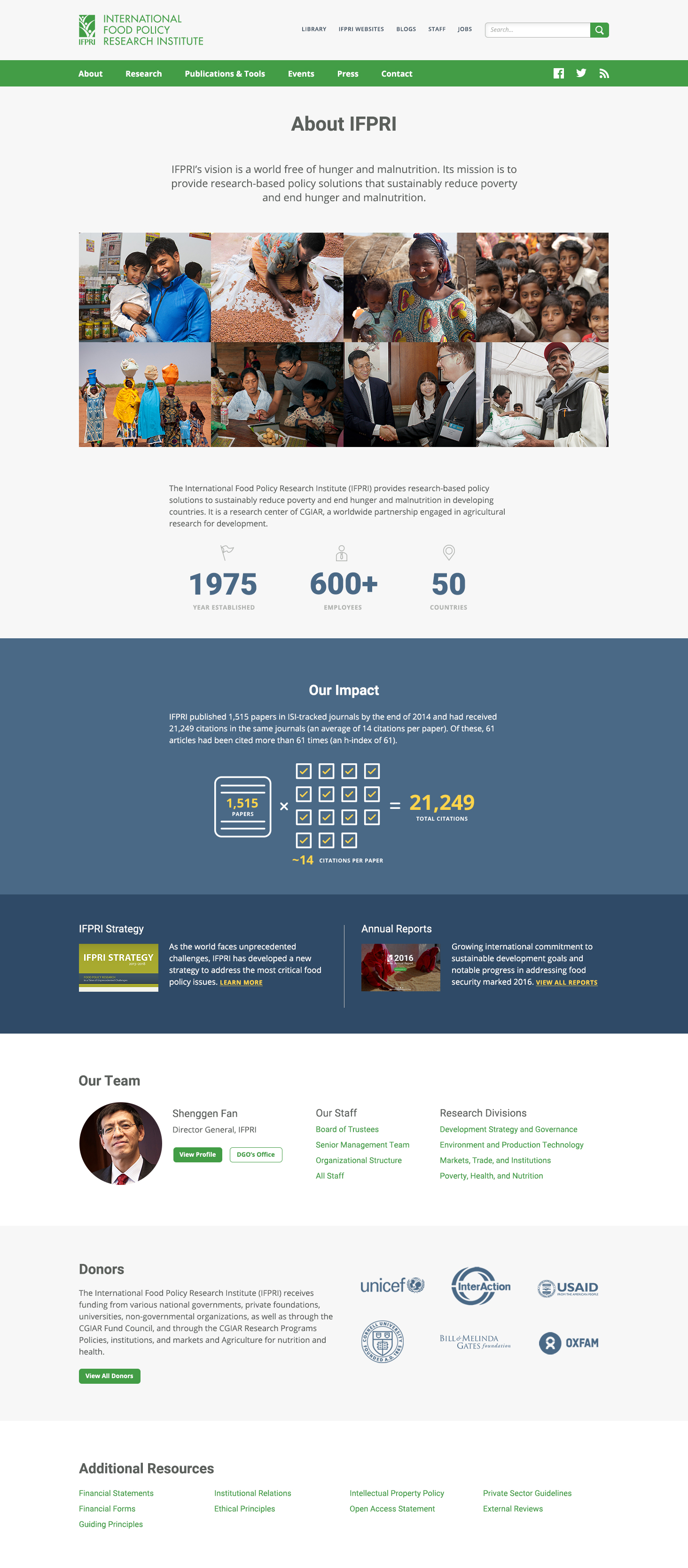
The old site implemented a dizzying array of type treatments and color application with no systematic approach. Calls to action were unclear and confusing, and color contrast was a major problem. I began by paring down and streamlining these styles through the creation of an accessible design system. This would provide the content-heavy site with the hierarchy and readability it desperately needed.
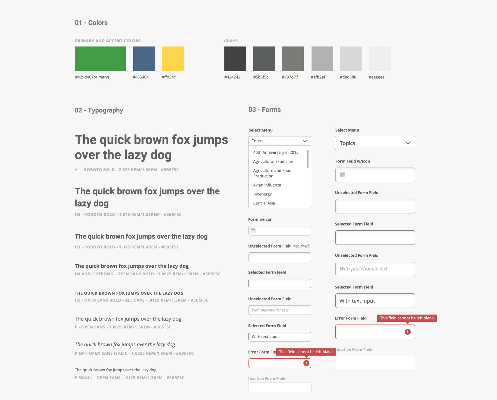
There were countless instances of all-caps, condensed type that diminished the users' ability to skim the site. I replaced those treatments with a modern, type-cased Roboto and Open Sans set at an 8pt grid for graceful scalability and avoiding visual degradation.
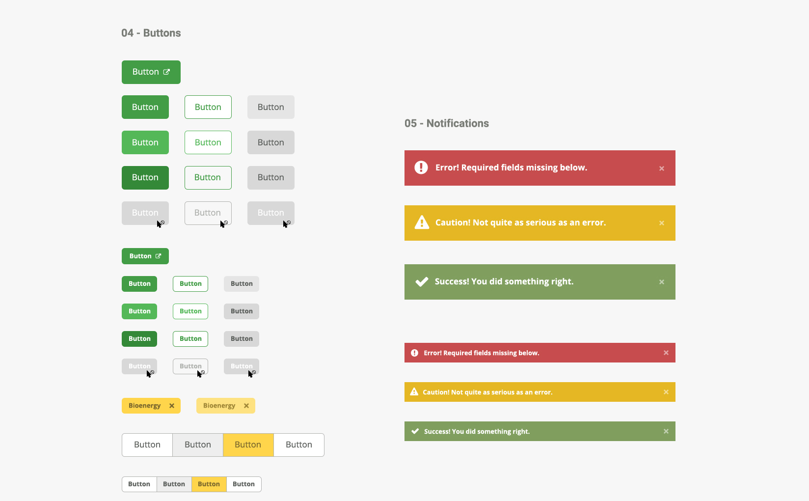
Color use on the former site was also inconsistent. Aside from superfluous color use, users found it difficult to distinguish between actionable, linked items and plain text. I assigned green underlined text as the inline link style. Yellow was used sparsely as an active state for form elements and tabbed buttons.
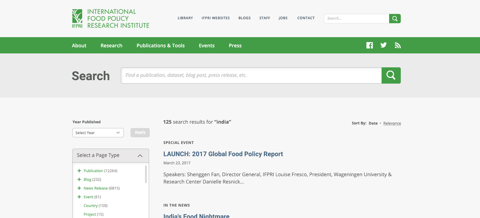
The most widely-used and frequently misunderstood functions on the site was the content search. IFPRI's research is the heart and soul of the organization, so we spent a good deal of time optimizing it for a wide range of users. The first issues I noticed with the search function (aside from the type and color issues mentioned above) included redundant and vague text, confusing filtering capabilities, and a lack of orderliness within the search listings. I approached the latter of those three issues by recommending the archiving of outdated irrelevant content within the listings and organizing content either by relevance or date.
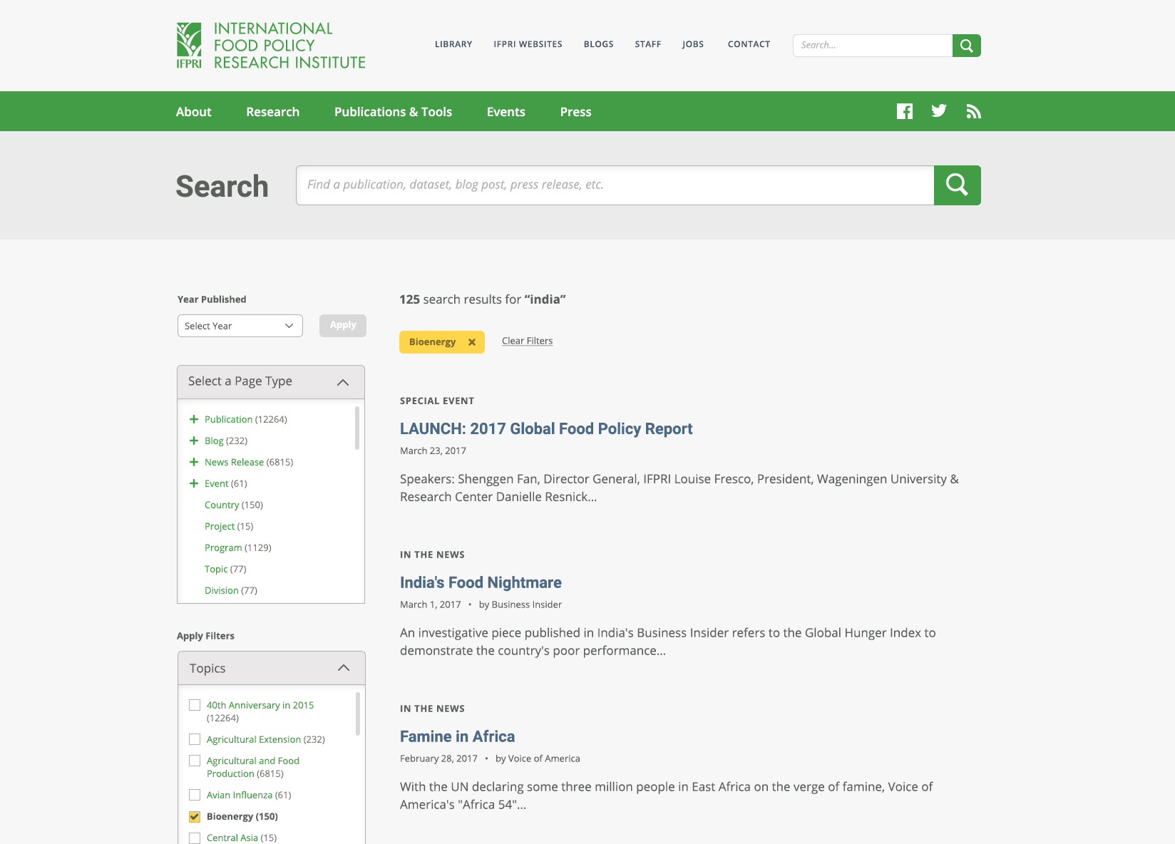
IFPRI's research content spans countless topics, geographical locations, and disciplines. Therefore, the filtering function required a great deal of attention. I reorganized the filters into an accordion-style layout and updated the visual indicators for selected and deselected states with greater contrast. Selected filters are moved to the top of the accordion section for easy access and to reduce scrolling. I also added filter buttons to the top of a search query as an added benefit for the user, helping them easily keep track of the filters they had selected.

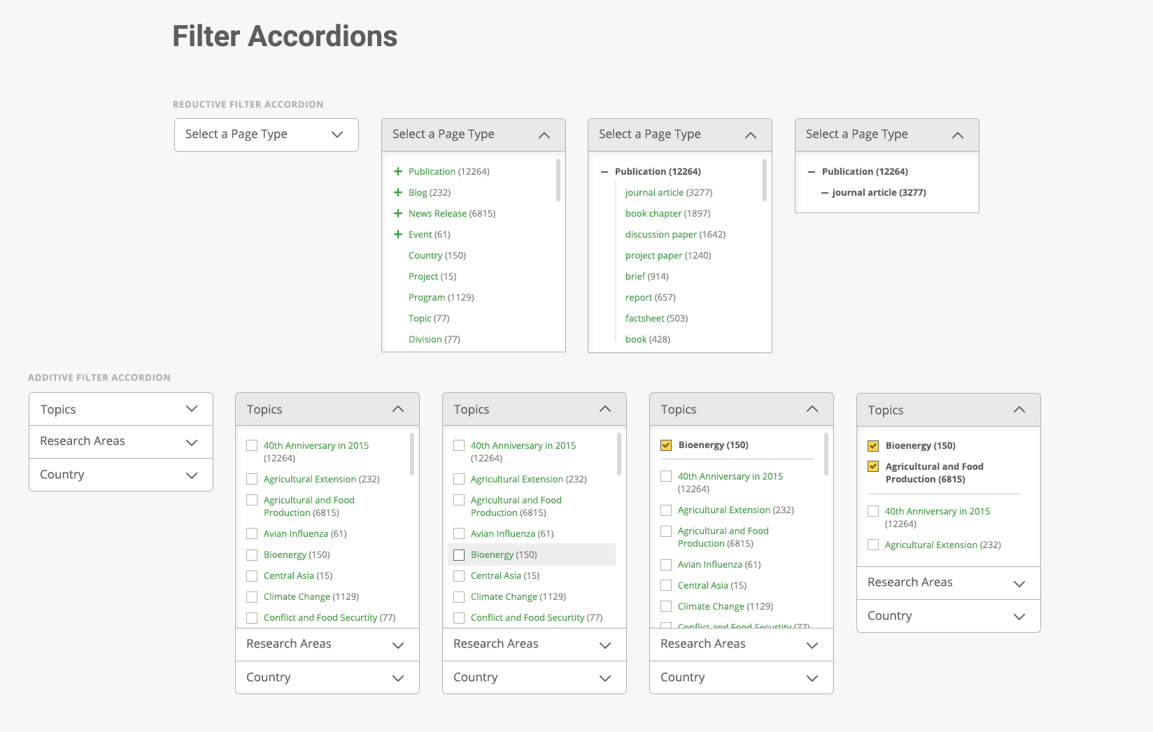

Research content is organized by both additive and reductive filtering, so I designed states and user flows for both.
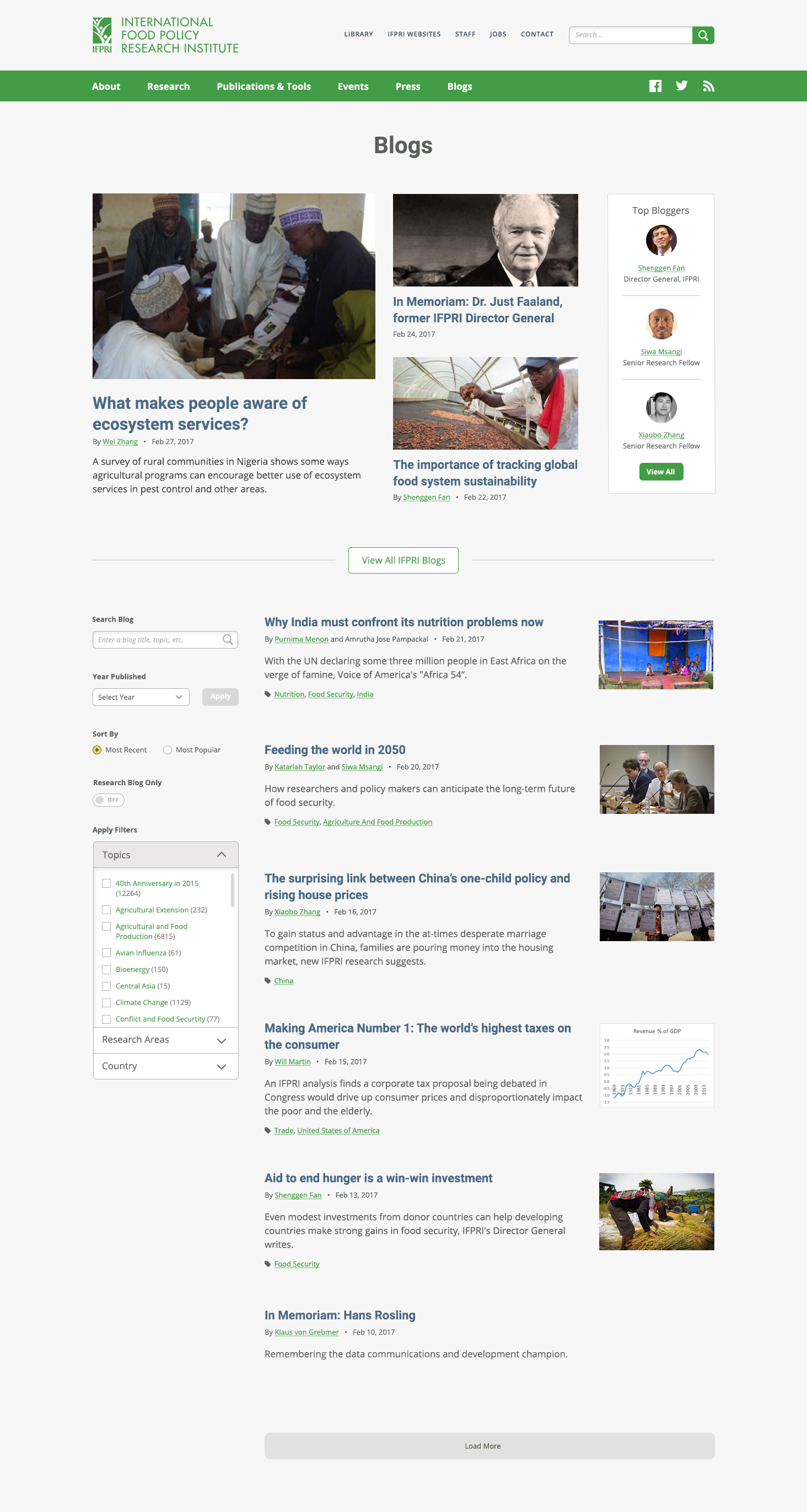
The original layout separated the filters in two places, which was disorienting for the users. I grouped all filter mechanisms vertically on the left side of all pertinent listing pages (i.e. search queries, blog posts, publication listings, etc.). Using a modular build, we were able to apply only the necessary search filters to each listing page with a minimal development footprint.
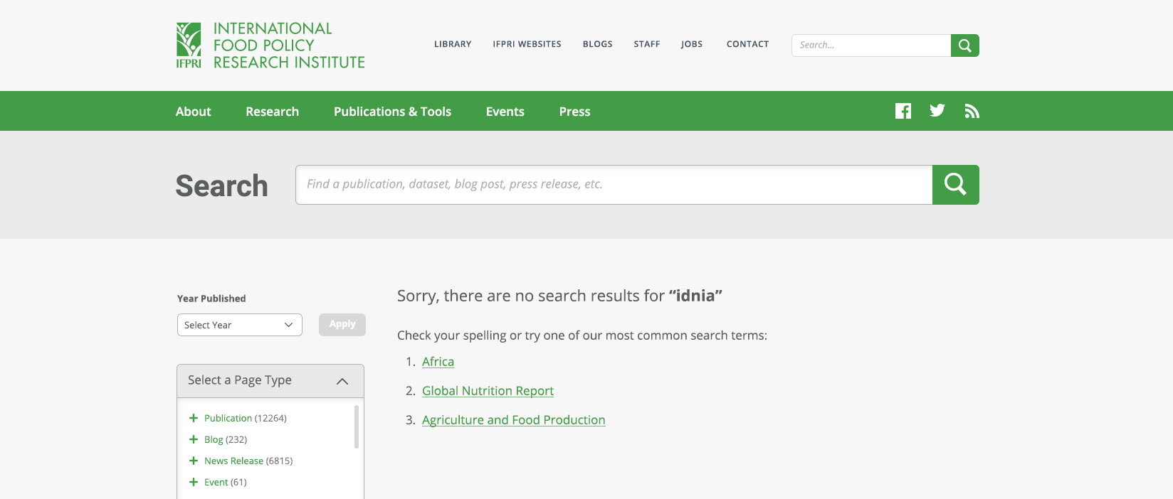
Empty states were also designed to provide users with additional, helpful feedback.
Once we finished optimizing the existing search function, I mapped the high-traffic portions of the site to gain a better understanding of current user flows while researching and devising possible improvements.
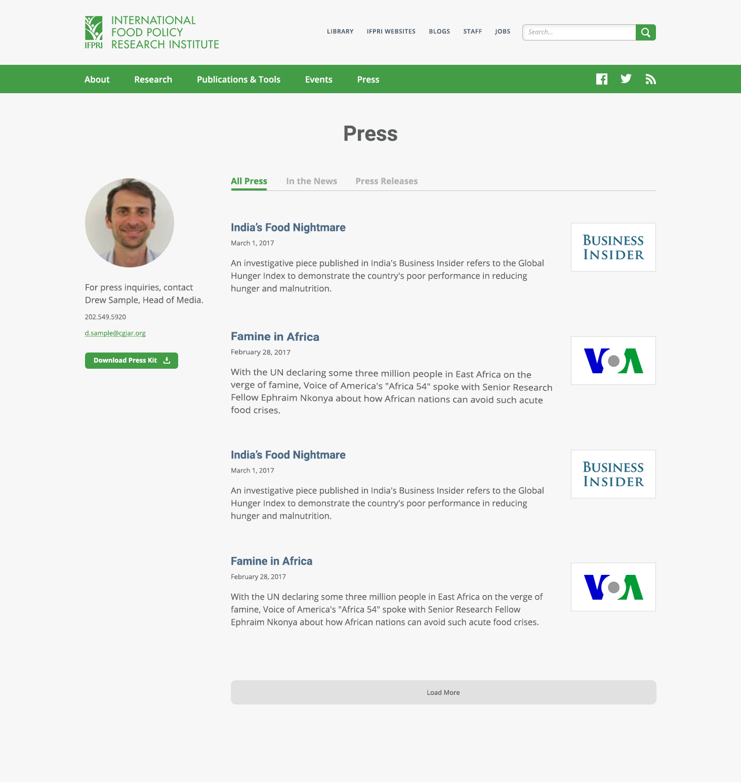
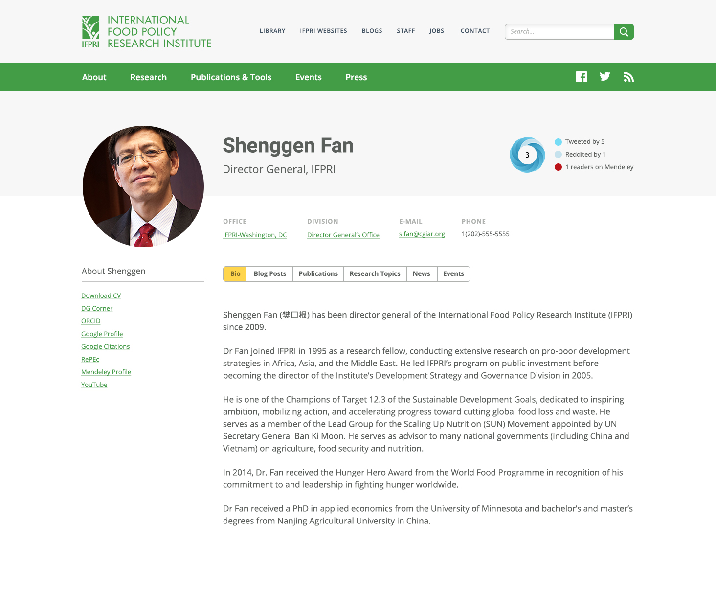
The majority of the experience was text-heavy. Little consideration was given for scanability, hierarchy, and visual interest. Using the organization's wealth of beautiful professional photography and their new design system, I designed alternative layouts to draw in and delight users.
