Client:
Merit America
Role:
Design Director
Skillsets Used:
Stakeholder interviews, A/B testing, usability testing, card sorting, wireframing, prototyping
On Track For an Elevated Career
Read more about Merit America’s background here.
Merit America’s learning program consists of two primary elements: in-person professional development coaching and online learning. Their online learning curricula comprises of a series of technical and professional development tasks that learners must complete satisfactorily to graduate and earn a Merit America certificate of completion. The technical portion allows students to earn the Google IT Support Certificate, with courses hosted by Coursera.
For context, below are definitions of users and stakeholders involved in the program:
- Learners: Users who will be completing online courses, receiving coaching, and earning certificates
- Learning Track: Series of courses learners are completing to earn one or more certificates, aligned to a high-demand career (e.g., IT Professional Support, Data Analytics, etc.)
- Learning Program: The end-to-end Merit America program, which includes a technical Learning Track + professional skill development + wraparound support services
- Site: A geographic region in which Merit America operates its Learning Program (note - this is not a brick & mortar site, rather a region such as “Dallas-Fort Worth”)
- Cohort: Group of learners who are participating in the Merit America Learning Program in the same site over the same period of time (will be 100-150 learners to start, and 2,500+ learners per cohort at full scale)
- Squad: Group of 4-6 learners in the same learner cohort who are completing the same Learning Track under the same coach
- Coaches: Merit America staff who will be guiding learners along their learning journey
- Site Directors: Individuals overseeing the coach and learner groups in a given geographic area
- HQ Administrators: Merit America staff who will be overseeing the portal and creating the learning track curricula
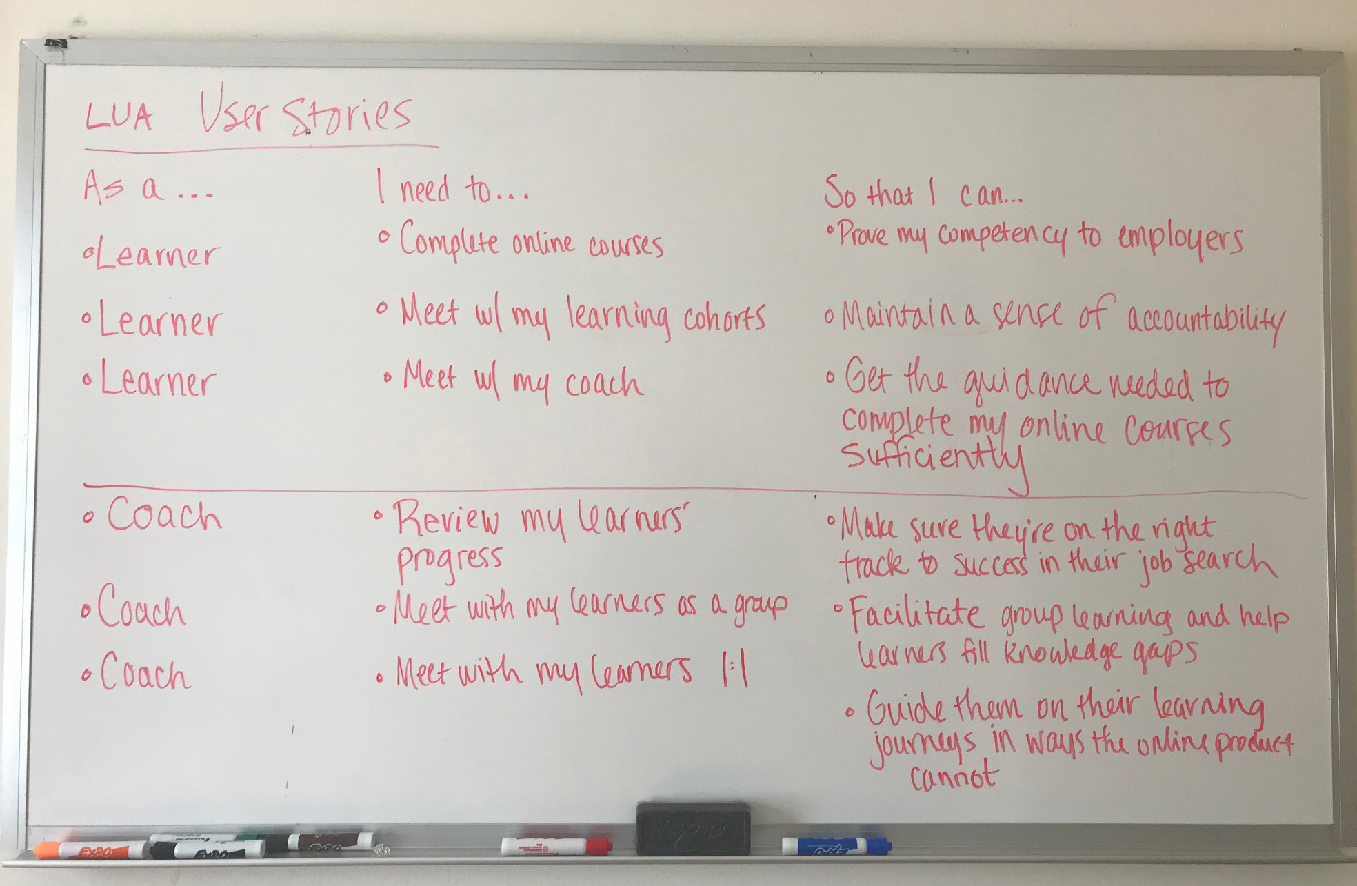
I designed a minimum viable product to track learners’ progress throughout the program, considering their experiences both online and offline. I would later dub the online experience “The Learner Portal”.
- For this project, we contracted with an external development team with a limited budget and short timeframe. Due to the rapidly-approaching timeframe, I attended daily stand-up meetings with the development team to keep things on track.
- Our program had a lot of unanswered and untested hypotheses, being in its infancy. We knew that we wanted our coaches and learners to track learners’ progress, but what would that progress look like? How would it evolve? The ability to pivot gracefully in reaction to new learnings became crucial.
- The tracking functionality needed to accommodate both learner needs and coach needs in a budget-friendly manner. Ideally, we would create a single experience that accommodated both.
- Our funders were keenly interested in our learners' progress throughout that program, so reporting on their progress quickly and efficiently was a must.
At our program’s inception, we planned for a 15-person cohort as a test run to discover any weak points and develop new hypotheses. From the very beginning, I participated in as many learner interviews as I could, gaining direct insight as we iterated on our personas. During that process, I discovered several crucial factors:
- Our target learner worked 20-40 hours each week while also dedicating time to complete our program. A mobile-friendly experience was absolutely necessary to accommodate their busy schedules.
- Some of our learners did not have reliable internet access, so we needed a no-nonsense platform that avoided superfluous bells and whistles. Our learners needed to get in, finish their assignments, and go about their busy lives.
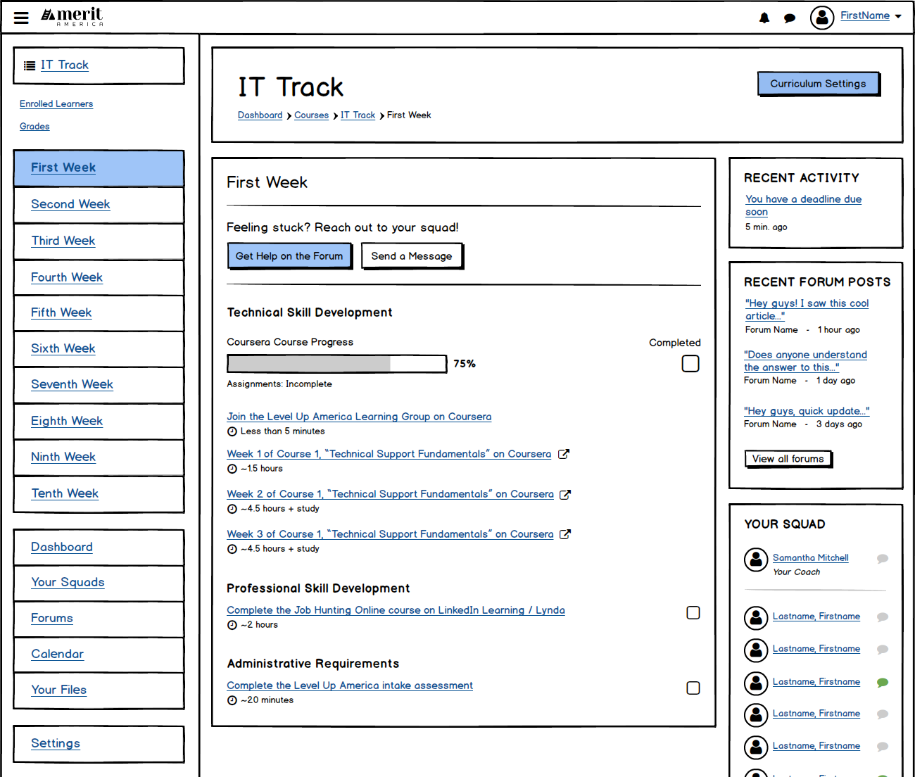
During the test cohort, my team developed a curriculum that incorporated the Google IT Support certificate, professional development tasks reviewed by their coaches (i.e. resume and cover letter development), and administrative tasks, including feedback surveys. Our coaches were tracking learner progress through a series of spreadsheets, the Coursera administrative portal, email, etc. Originally, assignments were due to be completed on a weekly basis, with a deadline of Sunday (we ended up changing the due date to Monday later because our learners worked primarily in service jobs that required Sunday hours). Ultimately, they needed a sort of one-stop-shop for progress tracking.
Part of the research process in defining our portal was identifying what could be accomplished with existing tools and what required a custom build. The bulk of our curriculum involved learners emailing files to our coaches; however, since our coaches were already inundated with email communications, creating a repository for these submissions was necessary. During my research process, I was introduced to a Learning Management System called “Moodle”. Out of the box, it provided us with basic tools (messaging, assignment creation, etc.) that we could then enhance with our custom tools. There is never a need to reinvent the wheel, so we tested the system vigorously. Understandably, with any framework, there would be usability learning curves. After analyzing our data, we realized these learning curves were necessary to get our MVP off the ground.
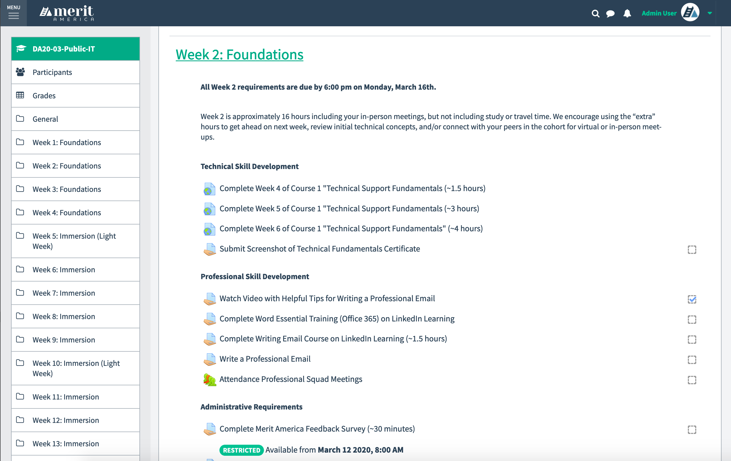
In tracking their progress, I immediately identified the need to explore how we would incorporate Coursera progress in our portal. The caveat here was that our requirements for each “Merit America Week” didn’t align with Coursera’s idea of a “Week”. Sometimes only three lessons within a Coursera “Week” would be due during a Merit America “Week”. Sometimes parts of multiple Coursera “Weeks” would be due during a Merit America “Week”. This language clash would become important to differentiate in our communications with learners. We ultimately directed them to completely ignore Coursera’s idea of a week and were diligent about constructing our communications as such.
This brings me to how we managed learner-to-coach and learner-to-staff communication. The benefit of treating our Alpha Cohort has one large test was our ability to try out multiple methods. One lesson we learned was providing too many modes of communication at once. Our portal had an out-of-the-box basic messaging system, but learners were more comfortable communicating with coaches via email and text. They were already familiar with these methods and it was easier for them. Ultimately, we created a Merit America Slack account and organized the channels by learner squad and cohort. The portal would not be a tool for communication.
After testing the out-of-the-box tools provided by Moodle, the two that we relied on significantly were the assignment creation tool and the assignment completion table, all organized within a Course (or what we would refer to as Learning Tracks). The assignment completion table data, married with the Coursera API, would be what allowed us to track our learners’ overall progress. We had plans to integrate other learning programs in the future, but wanted to test a single program for the time being. As we incorporated other learning programs in the curriculum before we could connect the portal with an API, we simply requested learners submit screenshots and other proof of their completion in the interim.
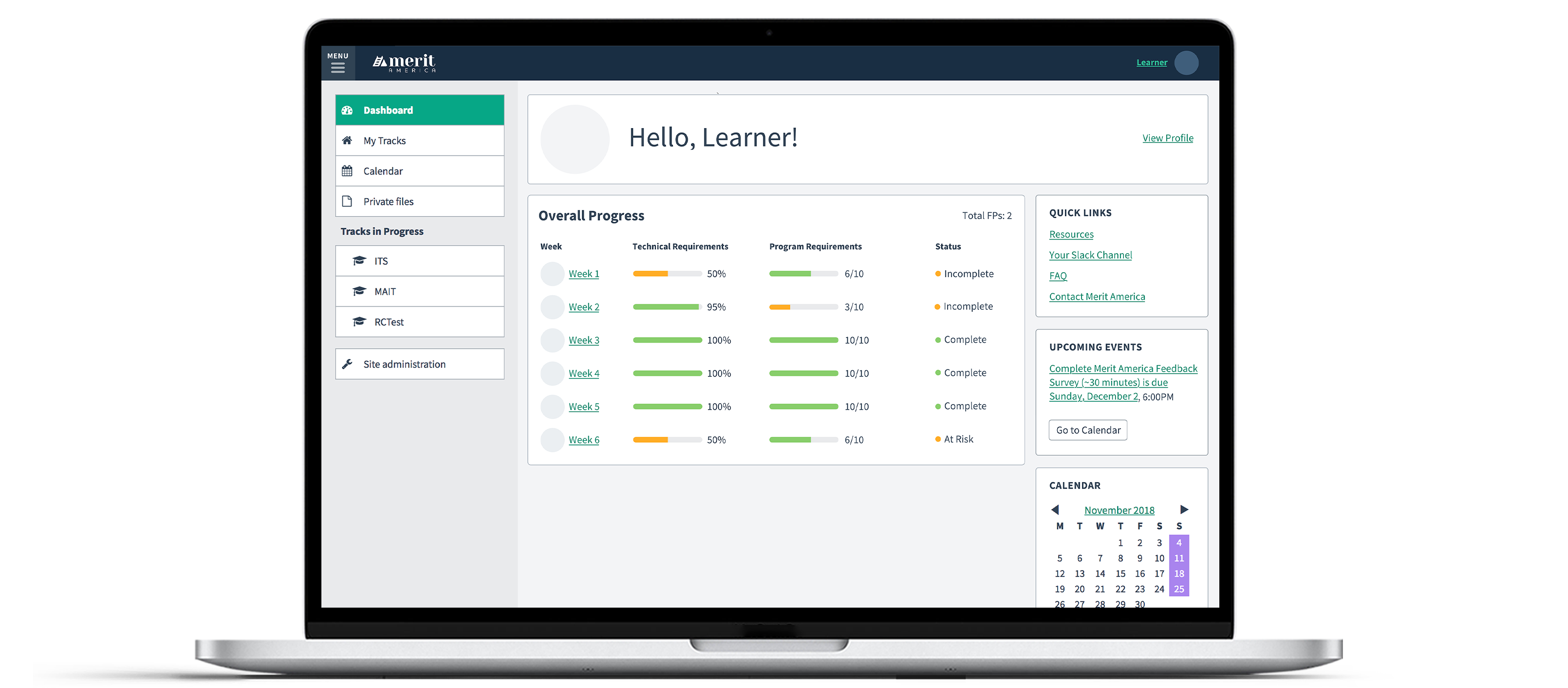
To understand how we would be tracking data, I needed to understand our program’s metrics and standards as they would exist initially. We had settled on a system whereby learners would receive a “Failed Participation” (also referred to as an FP) for not completing all of their past week’s requirements. We also needed a way to provide context to our learners and coaches about what their progress means in terms of Merit America’s requirements for the week in a budget-friendly manner.
We decided on a simple table layout, organizing learners by squad, with a status message based on their progress. It was easy enough to decide when learners have completed or not completed assignments for the week, but we tested a few variations of in-progress statuses. Through a series of usability tests, learners responded well to receiving an update in the middle of the week (in our case, this was Friday). We used the phrases “On Track” and “At Risk” to distinguish learners who were making good progress vs. falling behind. As part of our brand, we lean toward optimistic phrasing. “At Risk” implies that they may fall behind without the overly negative tone.
Throughout the portal design process, I collaborated quite closely with our team of coaches who would be using the portal daily. Using an out-of-the-box system meant there would be some learning curves to get them comfortable with the system. To lessen the steepness of said curve, I created screencast tutorials of some of the more challenging aspects of the portal. For coaches interested in “graduating” to managing the administrative side of the portal, I created a more advanced level of screencasts and organized the two groups accordingly.
By the time I began designing the portal’s interface, I solidified the initial iteration of our brand which provided a solid base for the portal design system. My goal was to design a budget friendly interface with accessibility, usability, simplicity, and consistency as top priorities.
Taking a page from Brad Frost’s website, the design system was designed using the principles of Atomic Design, where atoms (or simple design elements) are used to create components, to make up larger “organisms”, templates, and pages.

- After the portal launched, our coaches saw an initial decrease in their time spent on administrative tasks.
- Building a custom notification system in the portal was out of scope, so we incorporated Zapier into our workflow to send learners automated notifications via a series of Google Sheets. We saw an increase in learner completion once we began sending biweekly updates and the notifications became a crucial fixture in the program.