Client:
TechChange
Role:
Lead Designer
Skillsets Used:
A/B Testing, stakeholder interviews
Technology Training for the Future
 Get a sneak peek or request a demo
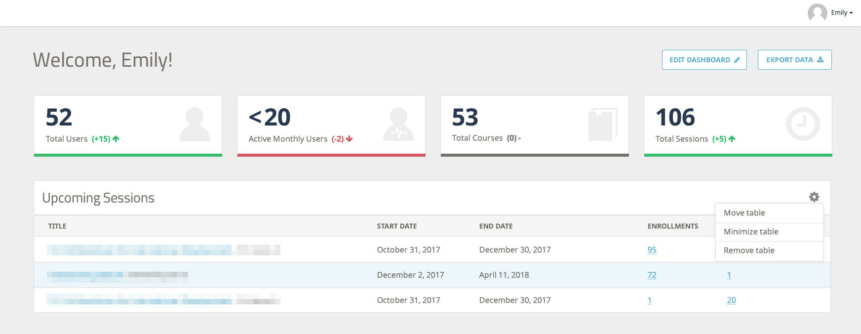
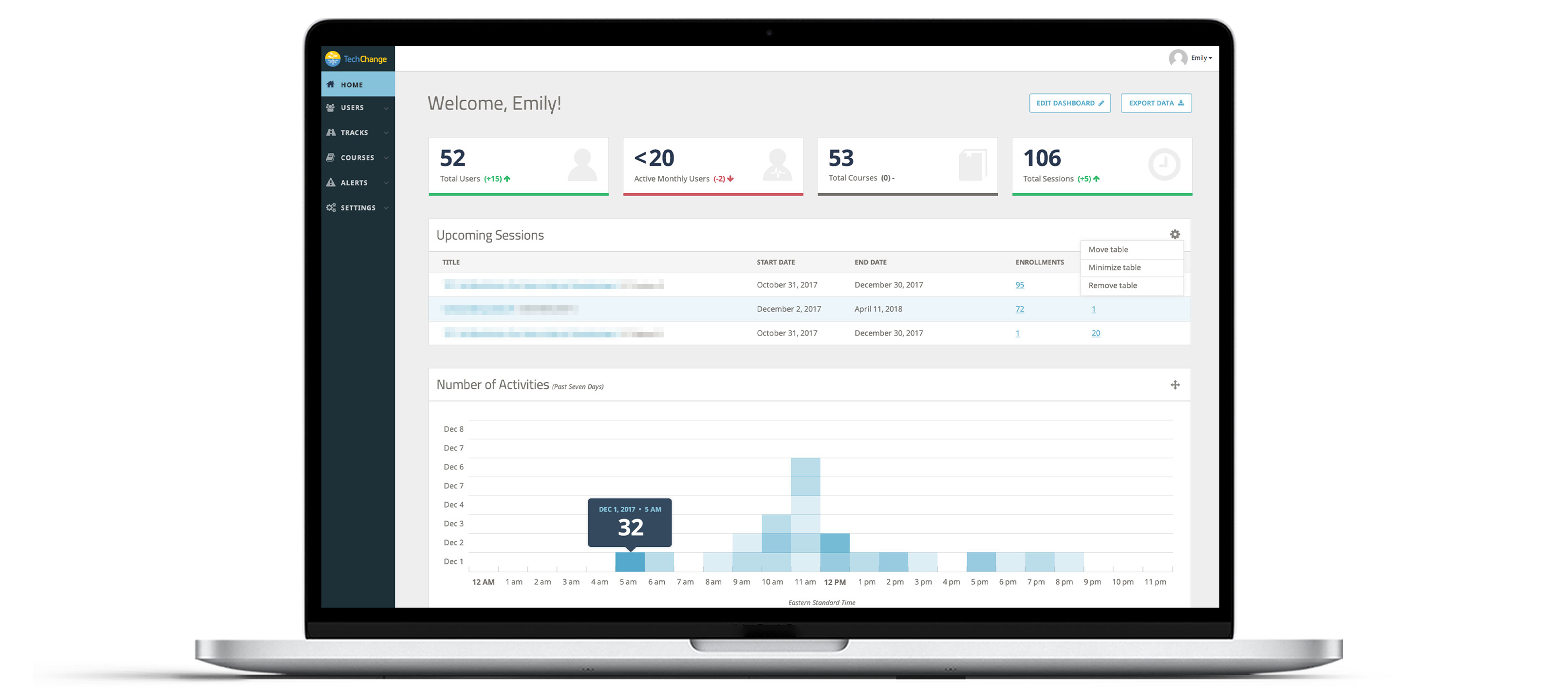
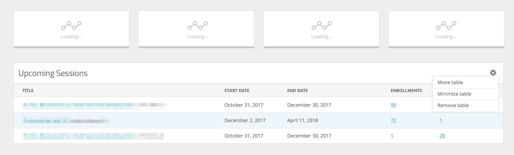
TechChange is an organization that provides online professional development in technology and social change. They connect public health and emergency response professionals with relevant content, experts, and certification using their facilitated learning platform. I collaborated with a team of front-end and back-end developers to redesign a more user-friendly partner analytics dashboard and introduction to the TechChange experience. This dashboard allowed partners (lesson providers) with an overview of how their courses were performing.
- The partner dashboard technically provided a brief overview of relevant data for its users; however, it lacked hierarchy and scannability. Users wasted time searching for key data from which they could drill down into the details.
- The dashboard did not accurately represent the organization’s brand identity to distinguish it from other platforms.
- There was a strict development schedule to adhere to, so I needed to prioritize short-term updates, while recommending long-term, “phase 2” updates
- The original dashboard had accessibility issues that needed to be addressed immediately.
- Several business goals were not being met with the current design, which are described in detail below.
The dashboard is the first thing that partners see when they log into their platform administration account. We wanted to make sure they felt confident in the technical competency of the solution we were providing. Additionally, we wanted the dashboard to be a launchpad for further exploration of the platform. Our goal was to engender feelings of a well-represented and active community throughout their courses.
TechChange's partners have very different uses for the platform. Some prioritized engagement and activity as metrics of success. For other clients, user growth, user activity, payments/sales, and engagement are the metrics of success. Some clients' success is driven by engagement, user growth, reach, etc. Other organizations are simply focused on reach.
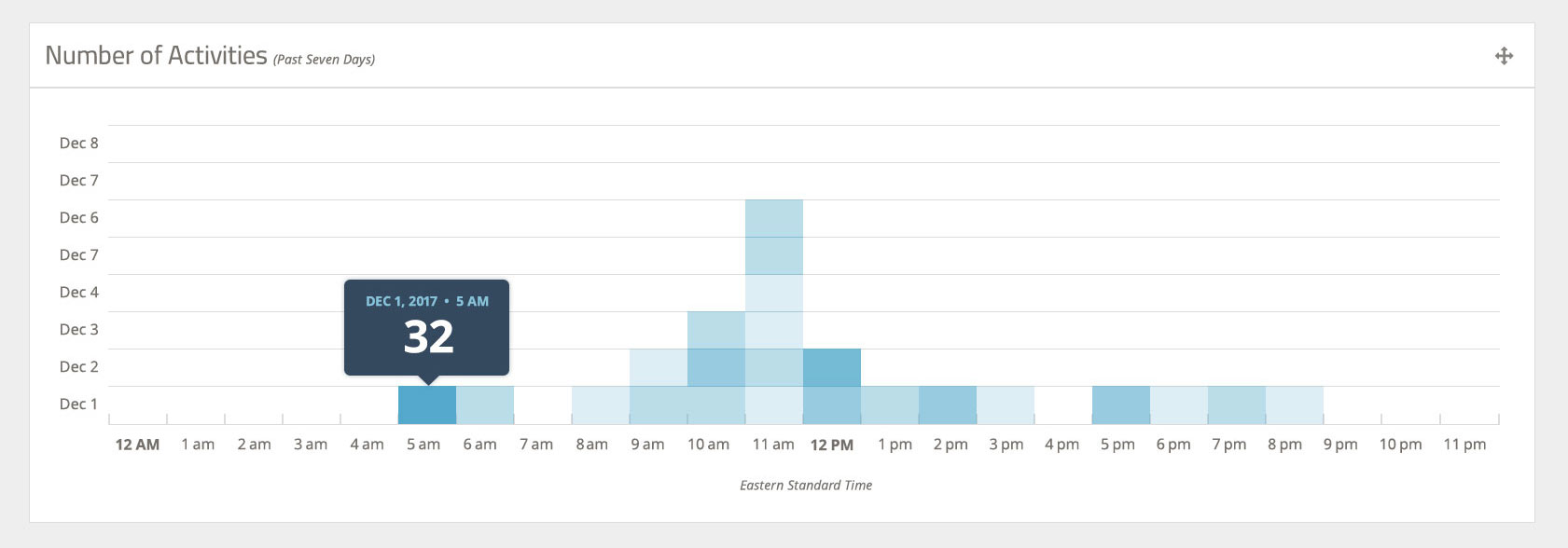
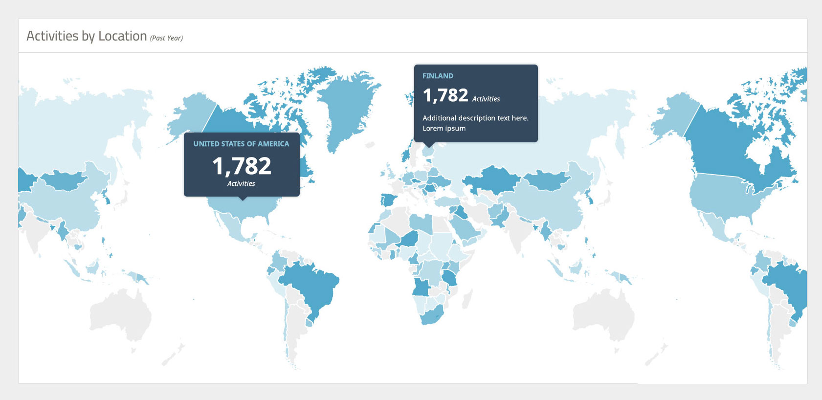
TechChange also wanted the dashboard to provide a quick snapshot of activity on the platform that makes administrators feel like they are getting value from the platform and that it's supporting their work. From a more practical standpoint, many of their clients are on plans that limit them to a certain number of Monthly Active Users. We needed the dashboard to reflect their current usage for a given month so that administrators know if they're getting close to their limit.
To address the first challenge, I made the following user interface updates:
- I increased the base font size to 16px for better readability (the original base font was rendering at 13px)
- I also increased negative space among and between the main content blocks to eliminate eye fatigue.
- The sidebar navigation also required some updates, including adding visual contrast in the active state, creating a stronger visual connecting between the active menu item and the main content.
- The original font style in the sidebar was condensed and set in all caps. I changed this to sentence-case and used the more readable Noto typeface for better readability.
The second challenge required a closer look at the user experience and how to accommodate stakeholders who had conflicting needs within the dashboard
My solution involved simply adding functionality that would allow partners to move blocks they see when they first log in, allowing them to prioritize their metrics.
I also included a link to change the settings for each individual block, instead of one settings link that would overwhelm them with more information than they needed.
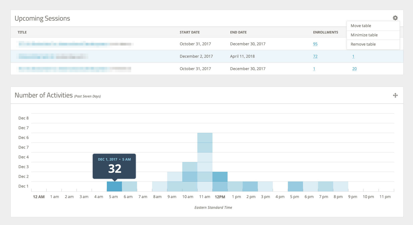
For the final business goal, I added visual markers denoting changes in usage levels with green and red arrows, and a gray en dash.