Client:
TrackMaven
Role:
Lead Designer
Skillsets Used:
A/B Testing, Prototyping
I've Got the Need for Leads!
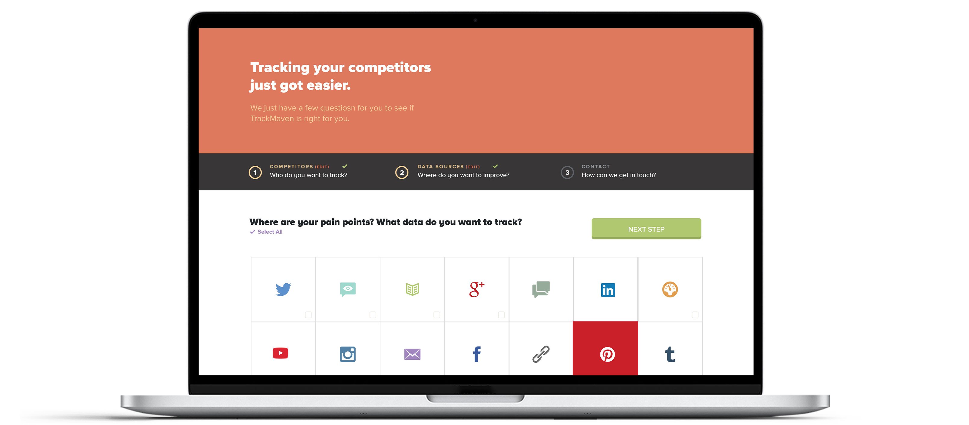
TrackMaven stakeholders wanted to see an increase in sales-accepted leads. We hypothesized that the lead-flow feature of the website needed to be streamlined to help our potential customers avoid wasting a lot of precious time.
This feature is crucially important as a means of driving leads to the TrackMaven sales team. The previous user flow was overly complicated and unnecessarily separated into three pages. The step indicators set forth helpful expectations for our users, and are a generally helpful feature when a process is divided into multiple stages. For this purpose, however, they simply added clutter.
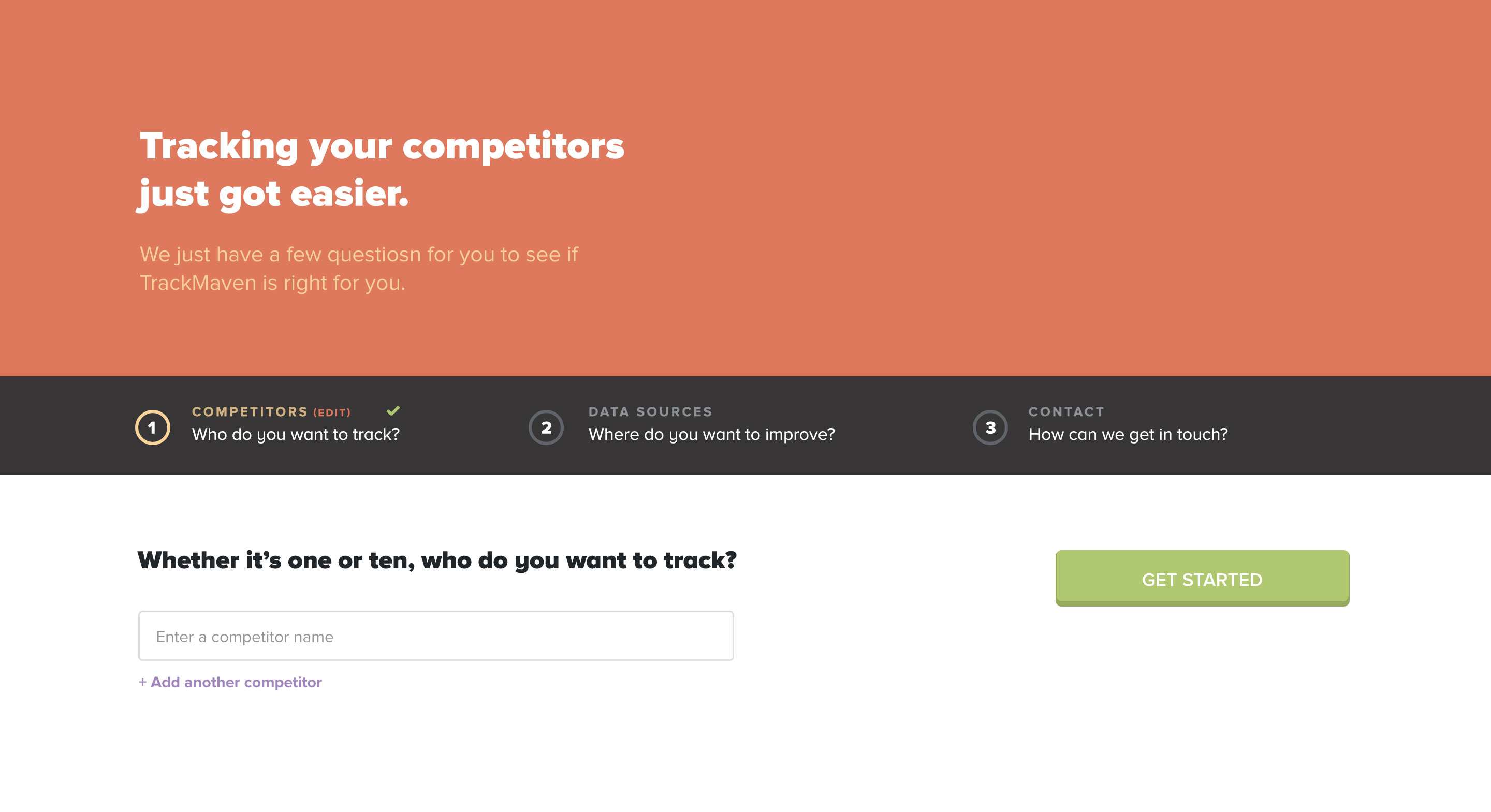
I saw a usefulness in the "Add another competitor" function, so I kept it in the next iteration. The form's simplicity offered potential customers an opportunity to add ten competitors without overwhelming or intimidating them with ten fields right off the bat.
The horizontal layout needed to go. The call to action's poor proximity and awkward language caused some confusion with our users.
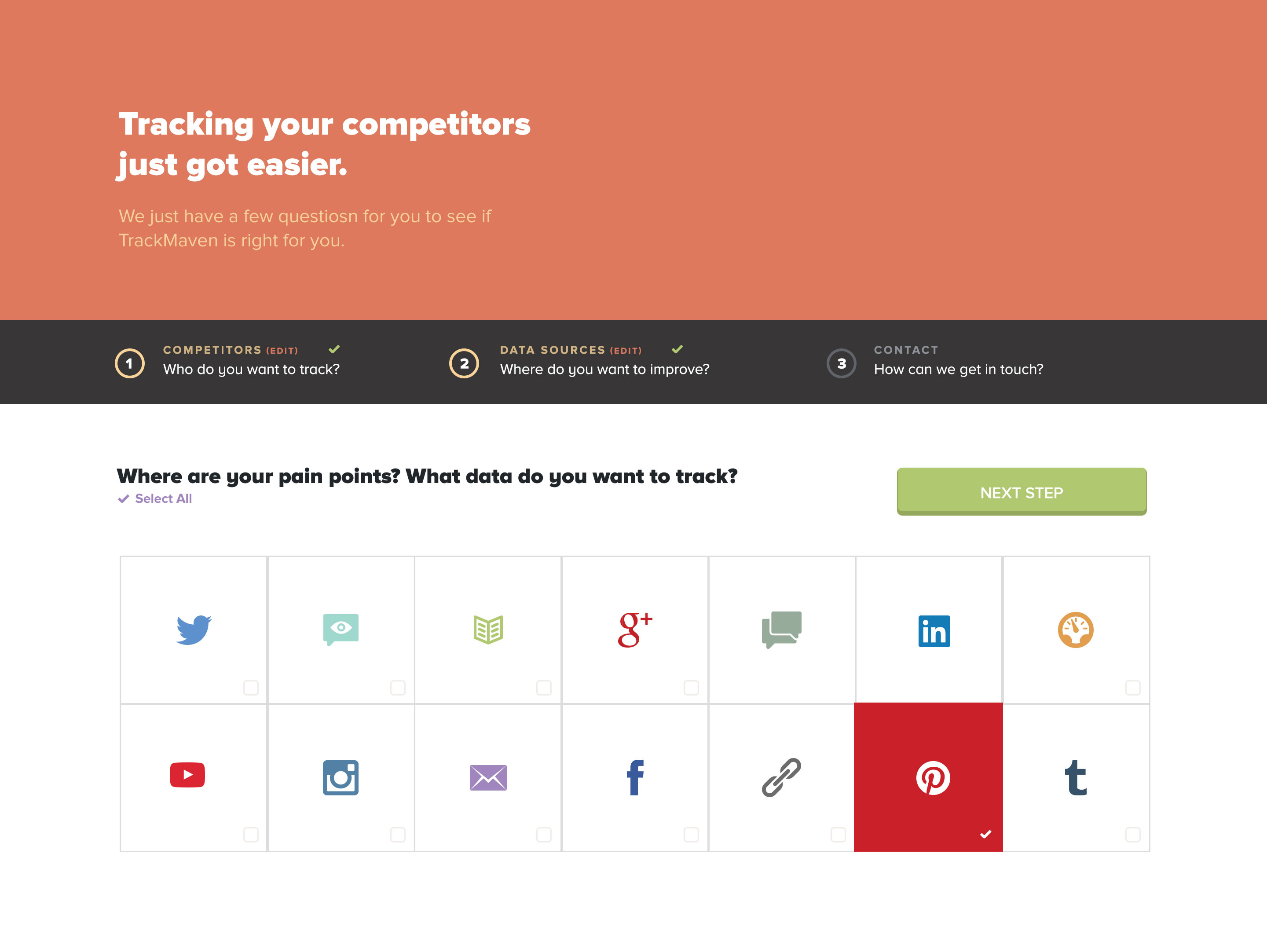
At first, I wanted to keep the icons because several of the social icons are easily recognizable (i.e. Twitter, YouTube, Facebook, etc.). TrackMaven provides tracking of certain channels, however, whose icons are not quite as recognizable without including labels. When I included labels, the icons became just another unnecessary visual obstacle for our users. The icons worked in some instances, but for this particular occasion, we wanted users to get through the form as quickly and painlessly as possible. So, I removed the icons and used labels instead.
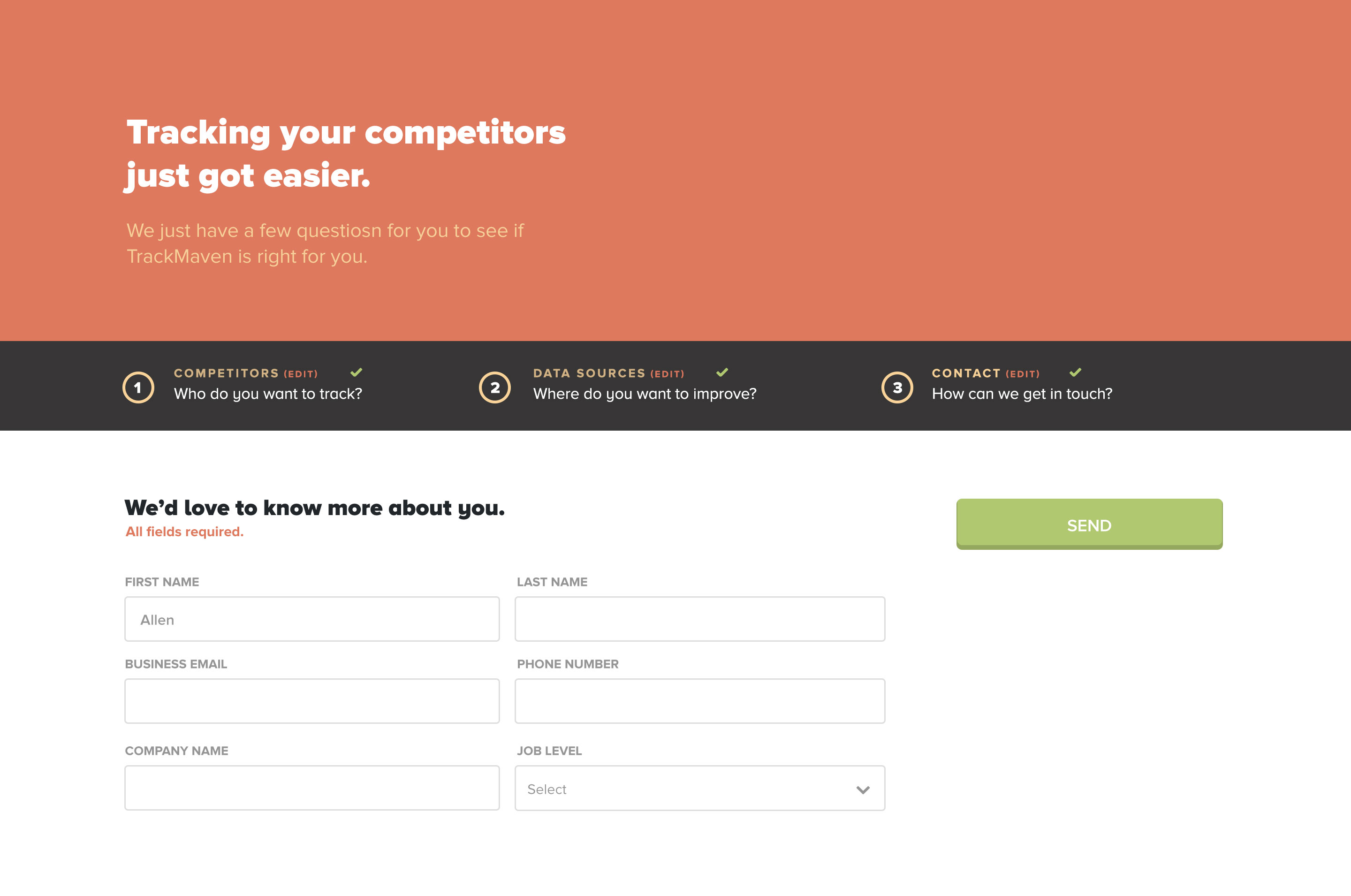
Again, the problematic horizontal layout rears its ugly head. Usability testing shows that reading a form vertically provides a smoother experience, rather than jumping from left to right, and top to bottom simultaneously. The one exception is when the form fields are related. Credit card information is a good example of this. In this particular occasion, I juxtaposed the first and last name fields, stacking them on top of the other fields.
We decided to remove the “job level” field, simply because we realized it wasn't providing useful information at this stage of the lead process.
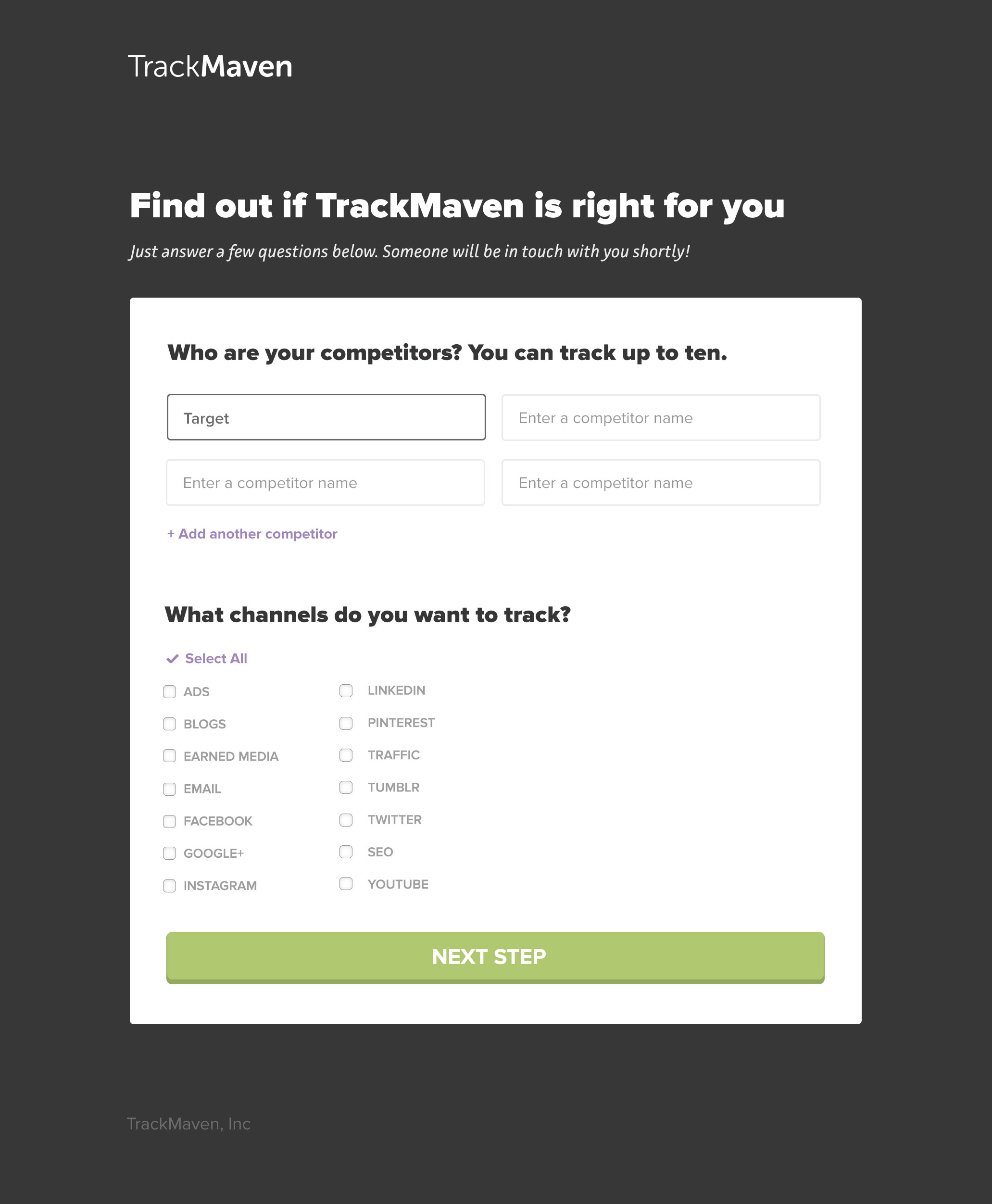
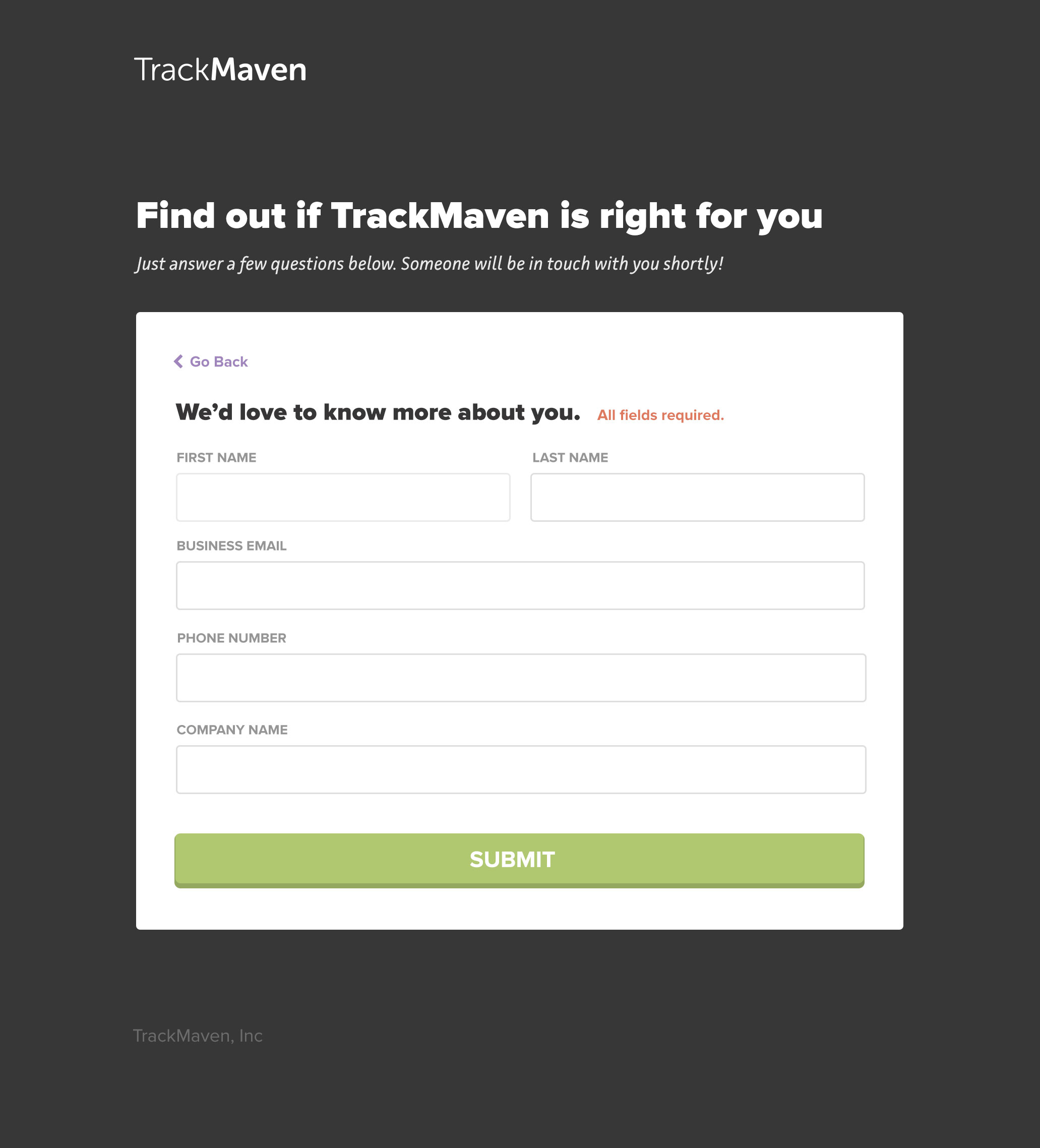
We A/B tested two different approaches against each other, and then tested the favored approach against the old one. The first option divided the form into two sections, and the second option was a single-page layout. I wanted to be absolutely sure that a single-page option was the best solution, and that it wouldn't bombard users with too much information.
I pared down color use to lighten the visual load and I used black to draw attention to the form. I also enlarged the call-to-action button and changed the text to read "Submit". This tested more favorably with users than "Send".
Users favored the single-page version to the two-page version at a ratio of 2:1. When we tested the single-page layout to the old approach, users favored the new layout unanimously. One quarter after implementing the new layout, TrackMaven saw a 24% increase in sales-accepted leads.